
Maison Guénard
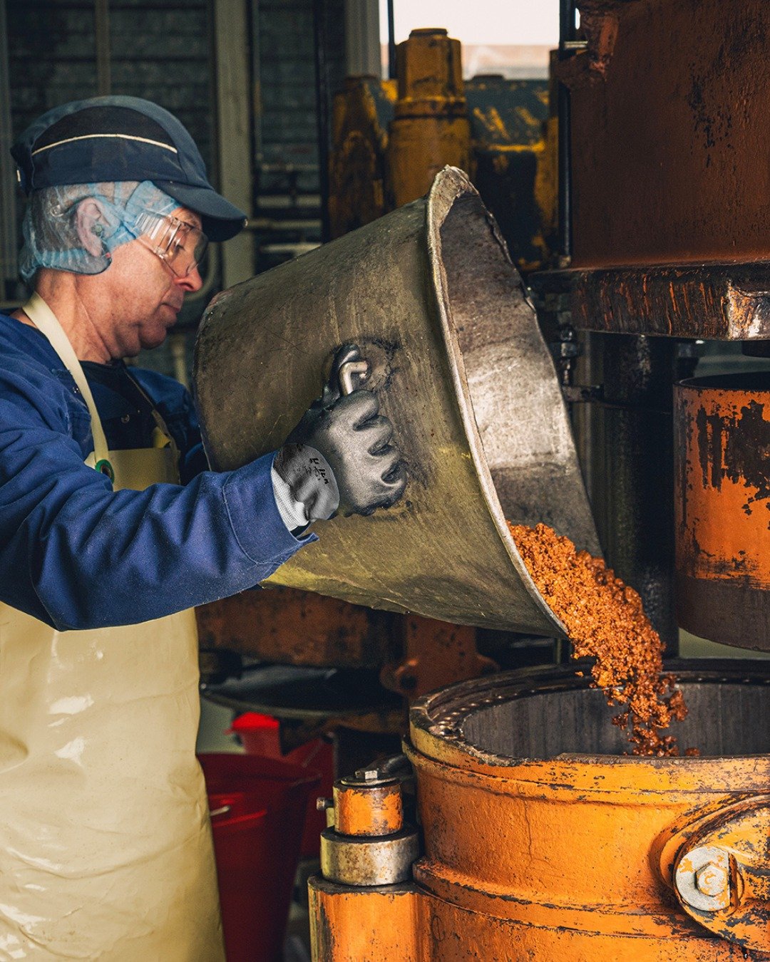
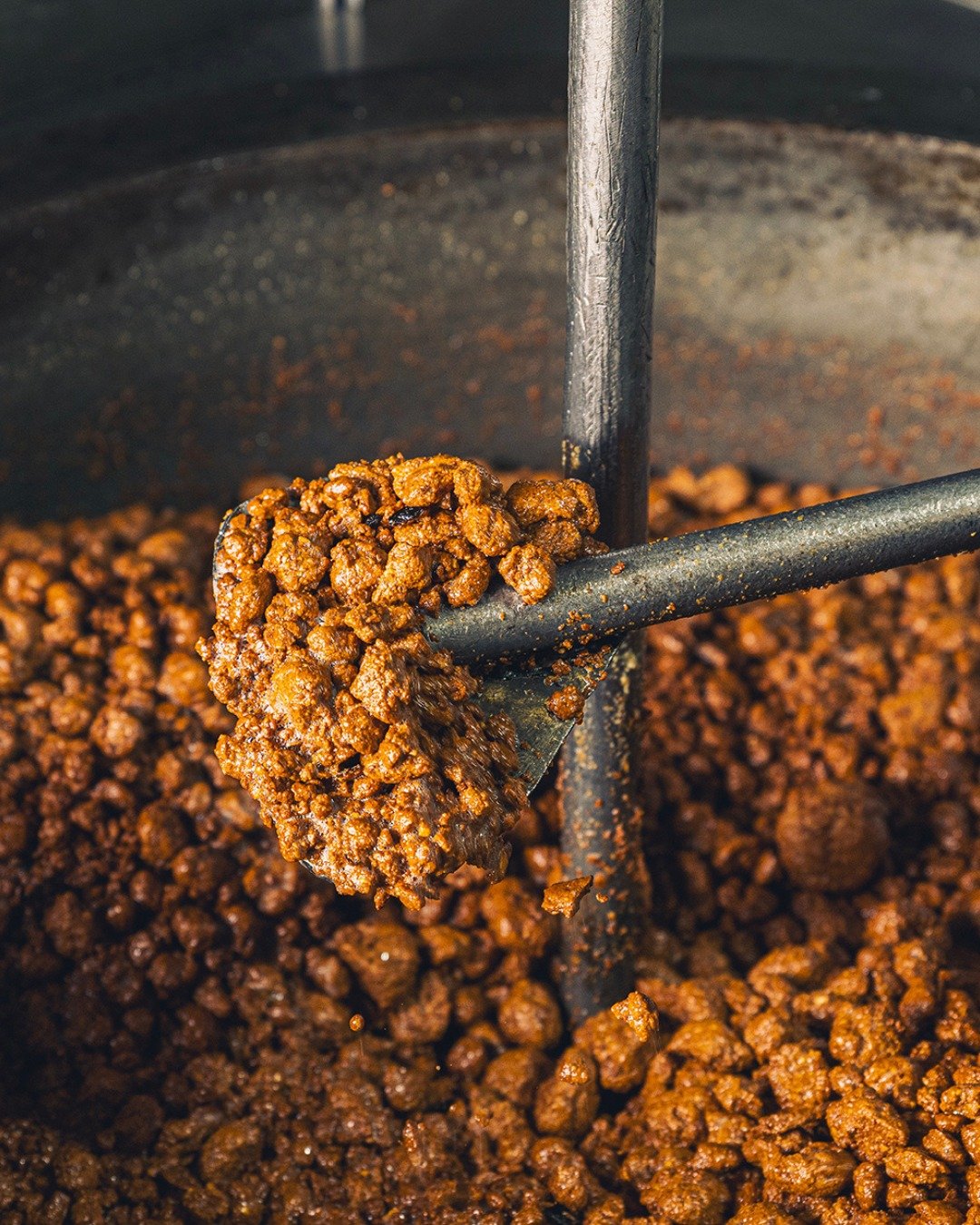
Rooted in the Vallée du Cher since 1824, Maison Guénard has built its identity around craftsmanship, exceptional ingredients and the art of revealing the best of each fruit.
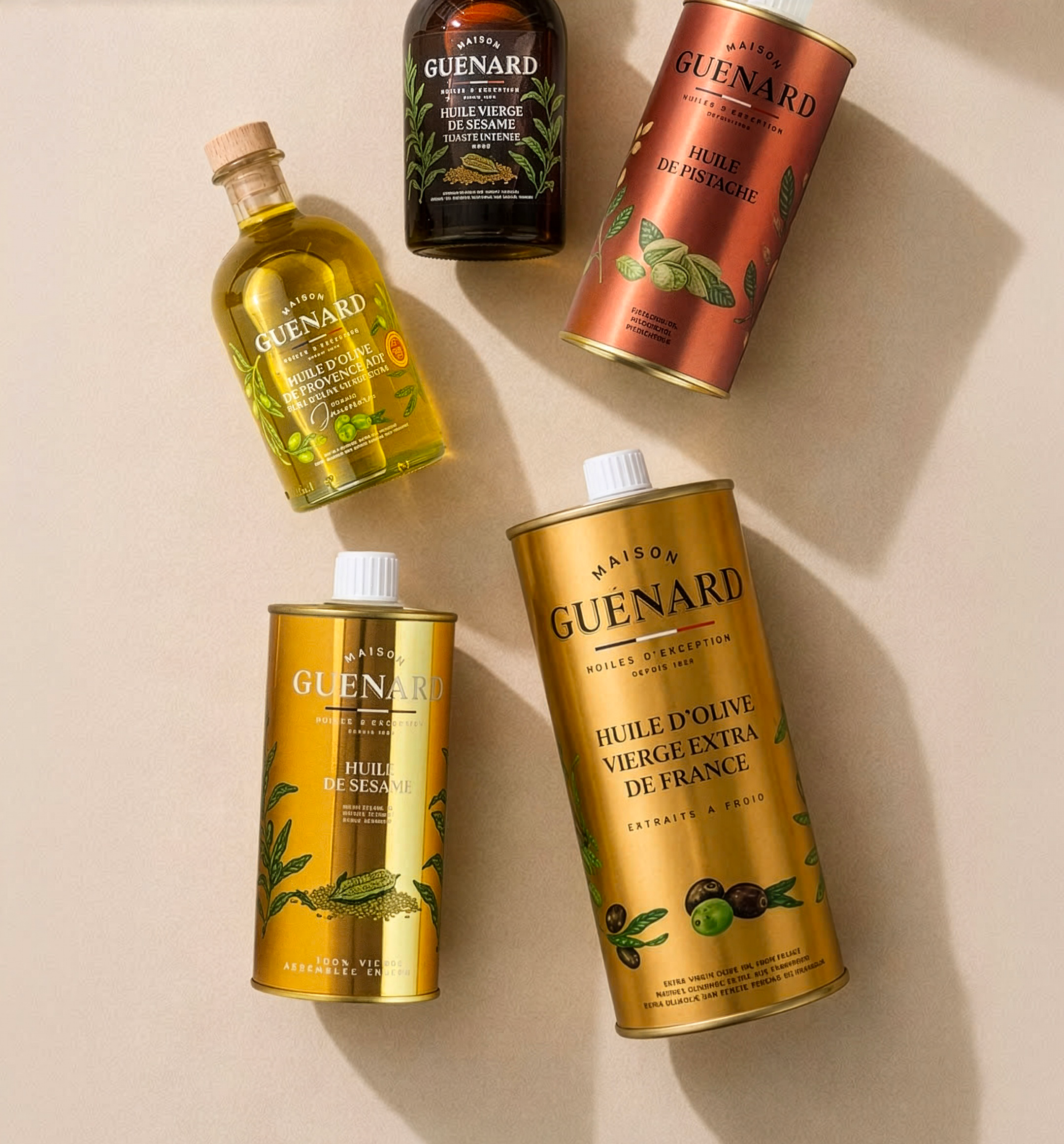
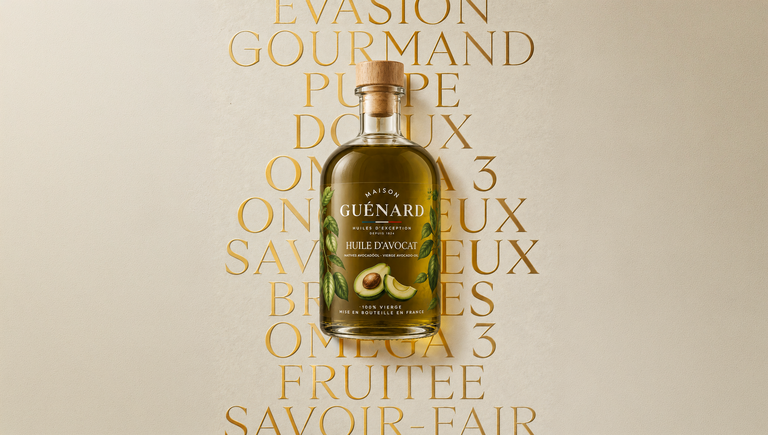
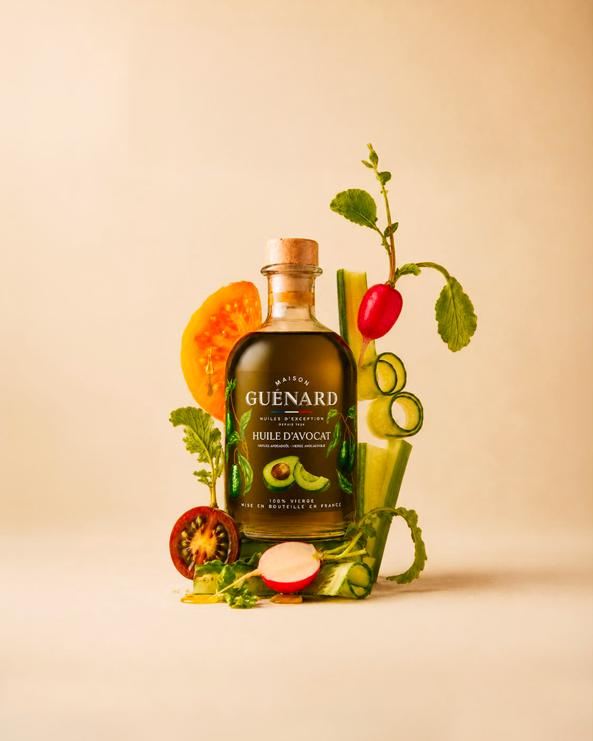
Aoka reimagined the Maison through a complete rebrand, from logo and visual identity to brandbook and packaging, balancing heritage with a more contemporary and distinctive expression. The packaging illustrations were co-created with illustrator Marianne Ratier.
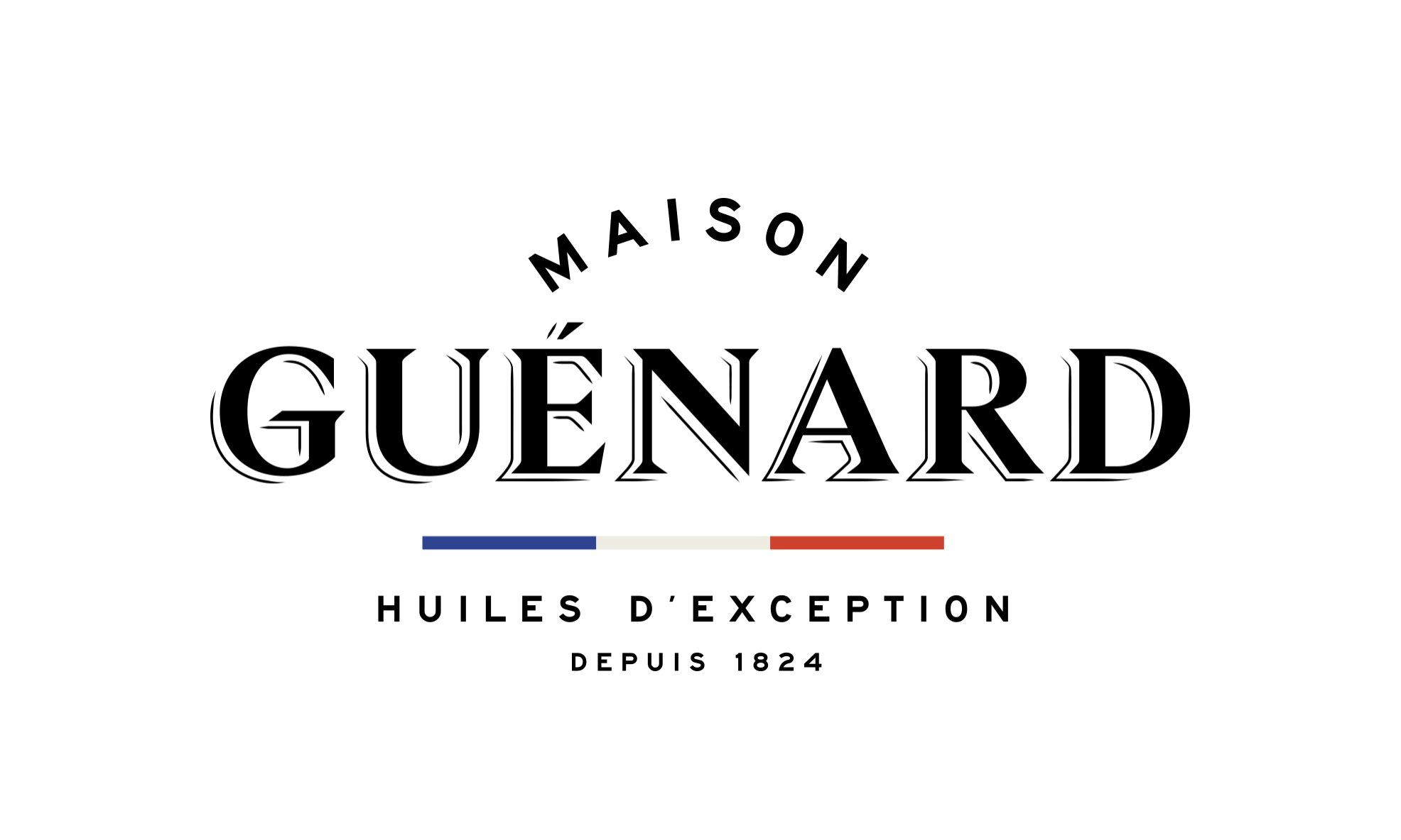
The new Maison Guénard logo balances heritage with a more contemporary expression. Its typography gives the Maison a strong, refined presence, while the “Depuis 1824” signature and tricolour detail reinforce its French roots and history.

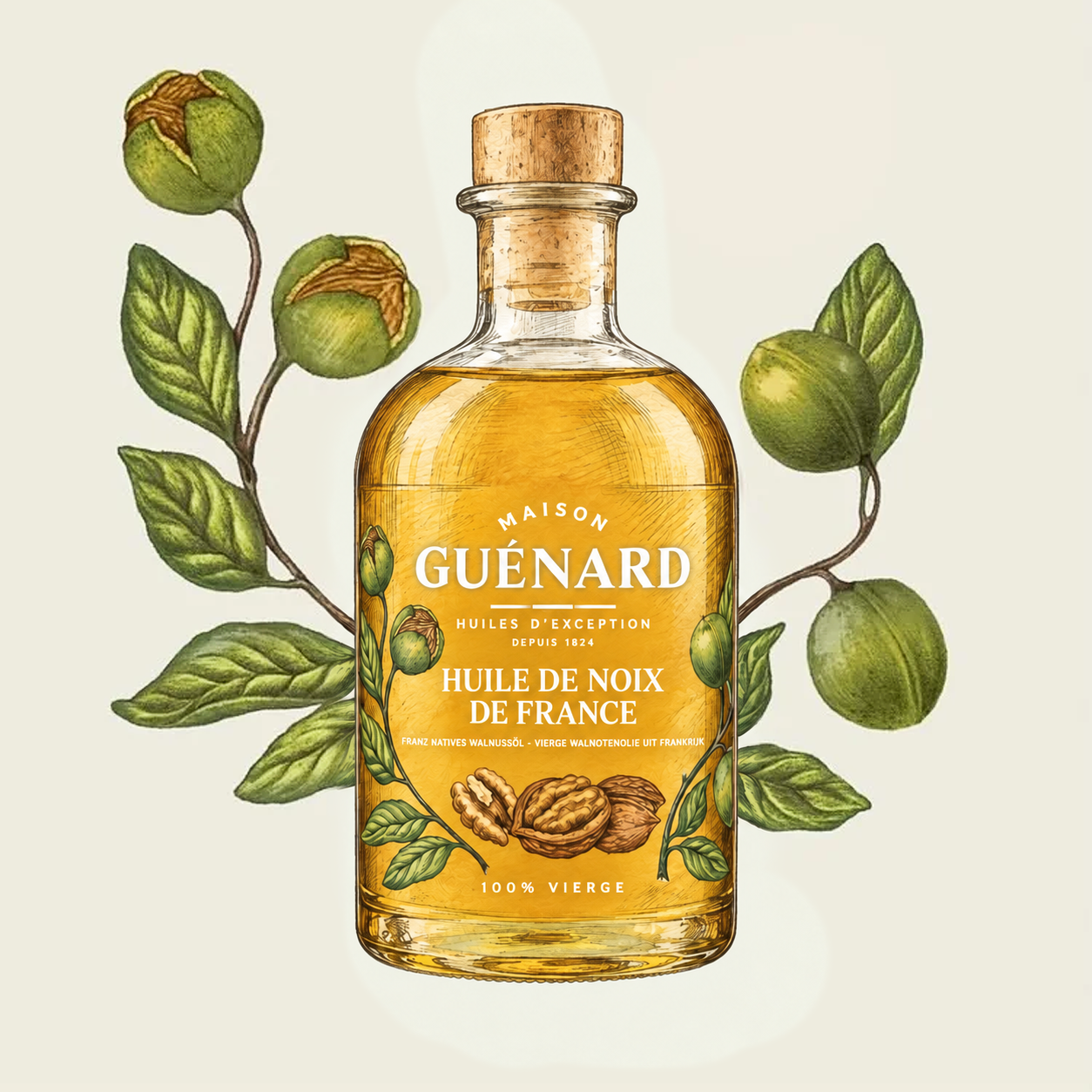
A botanical language
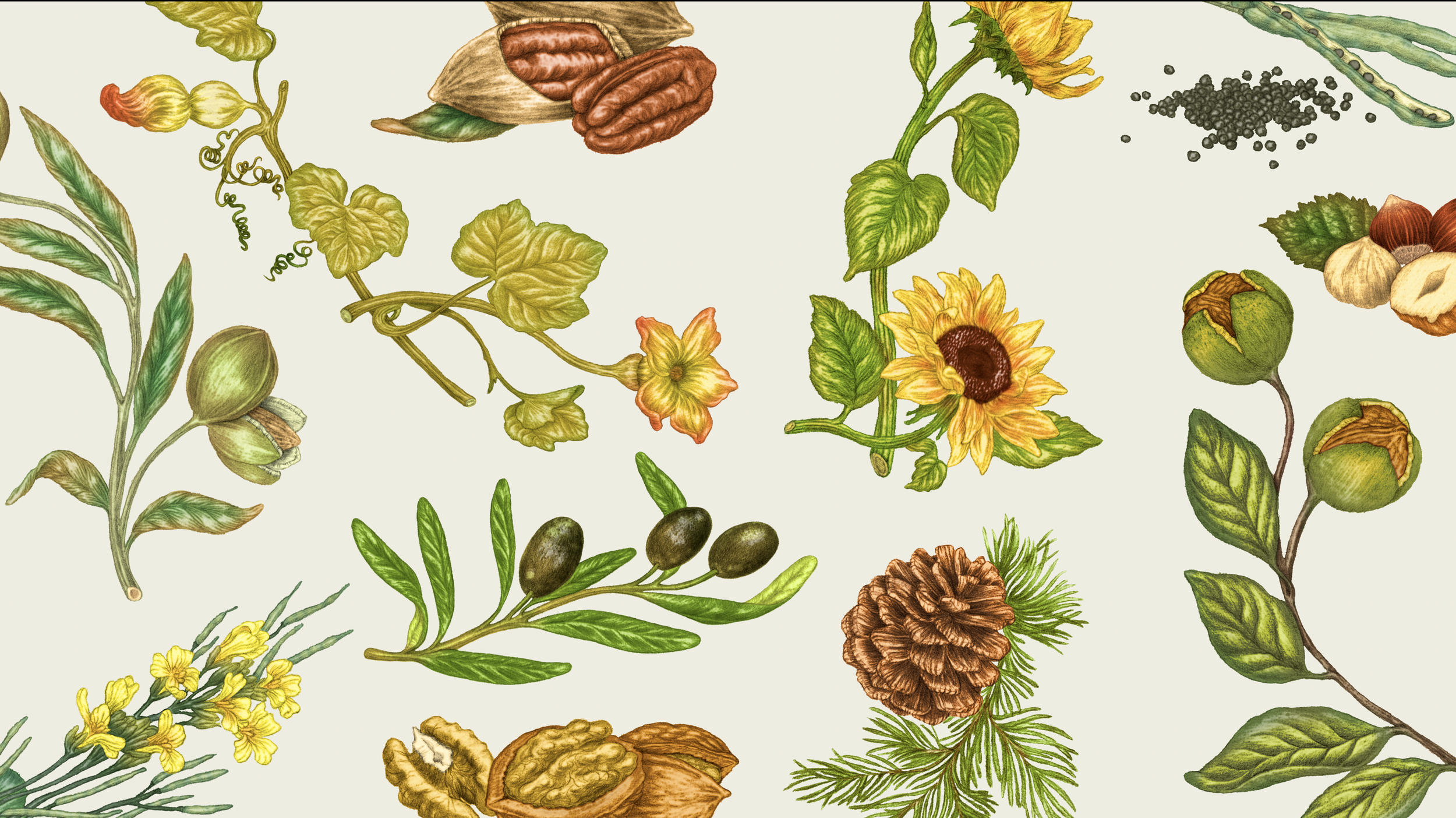
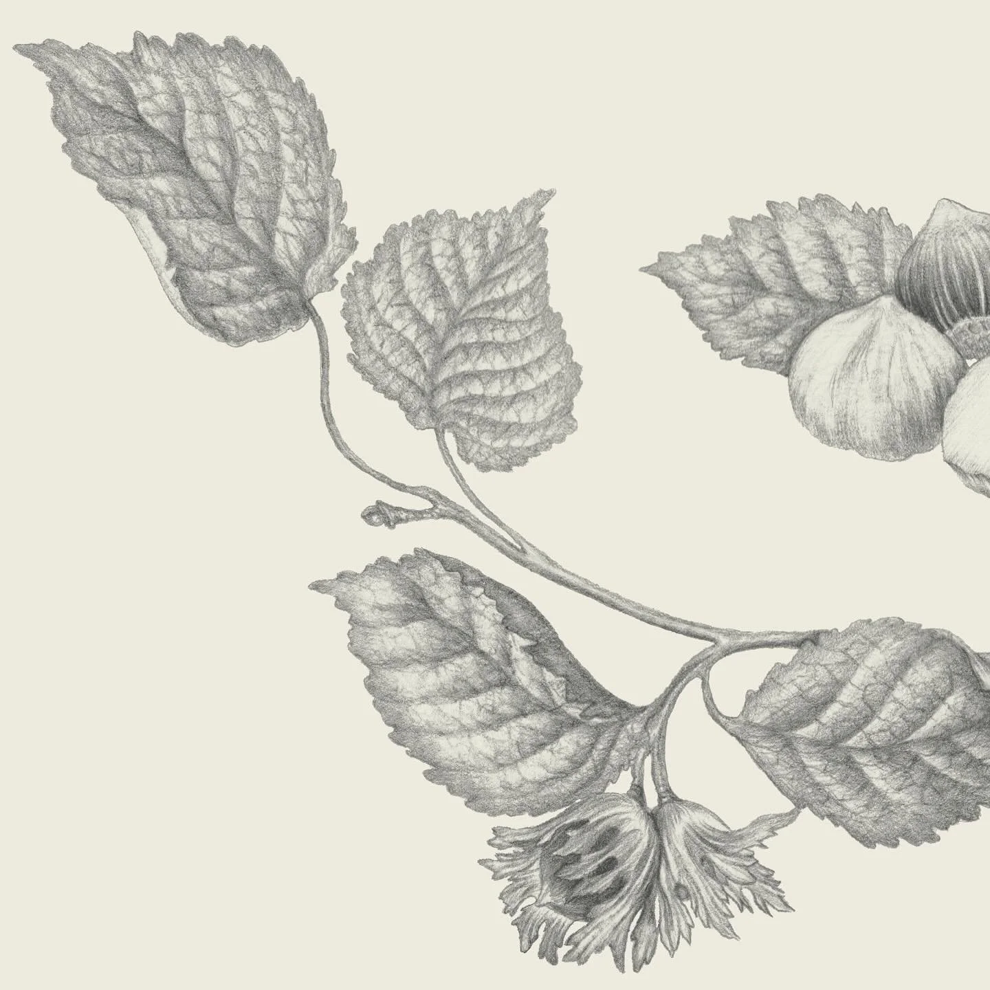
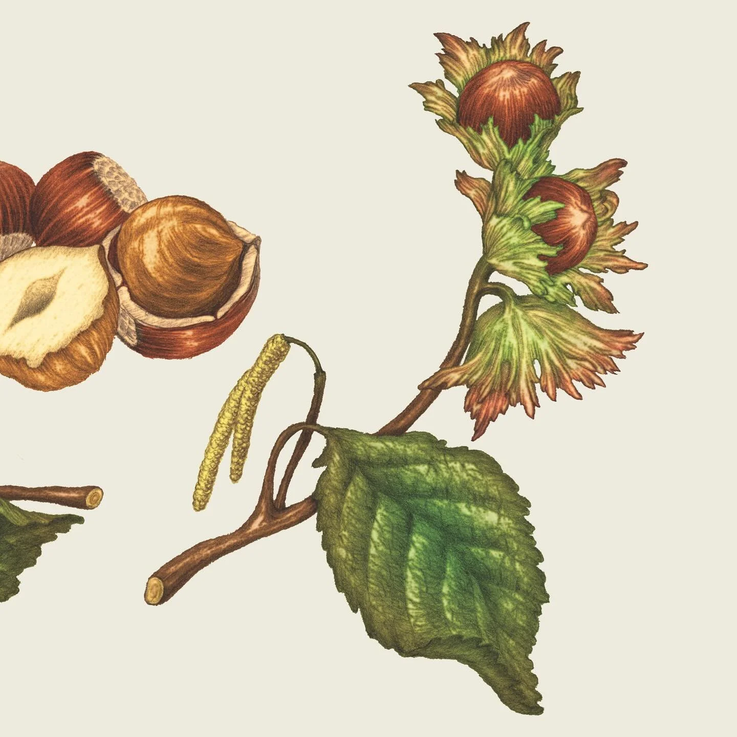
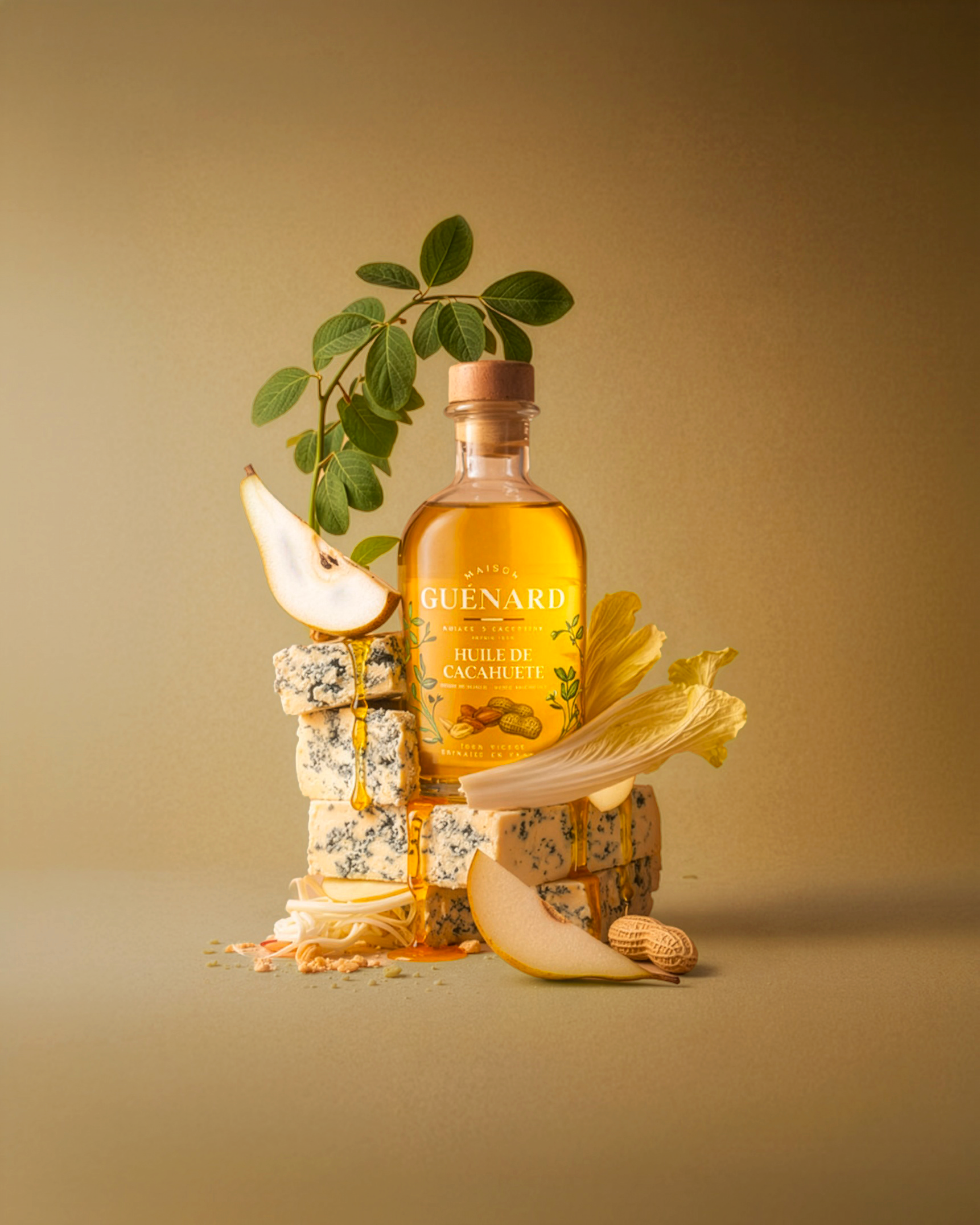
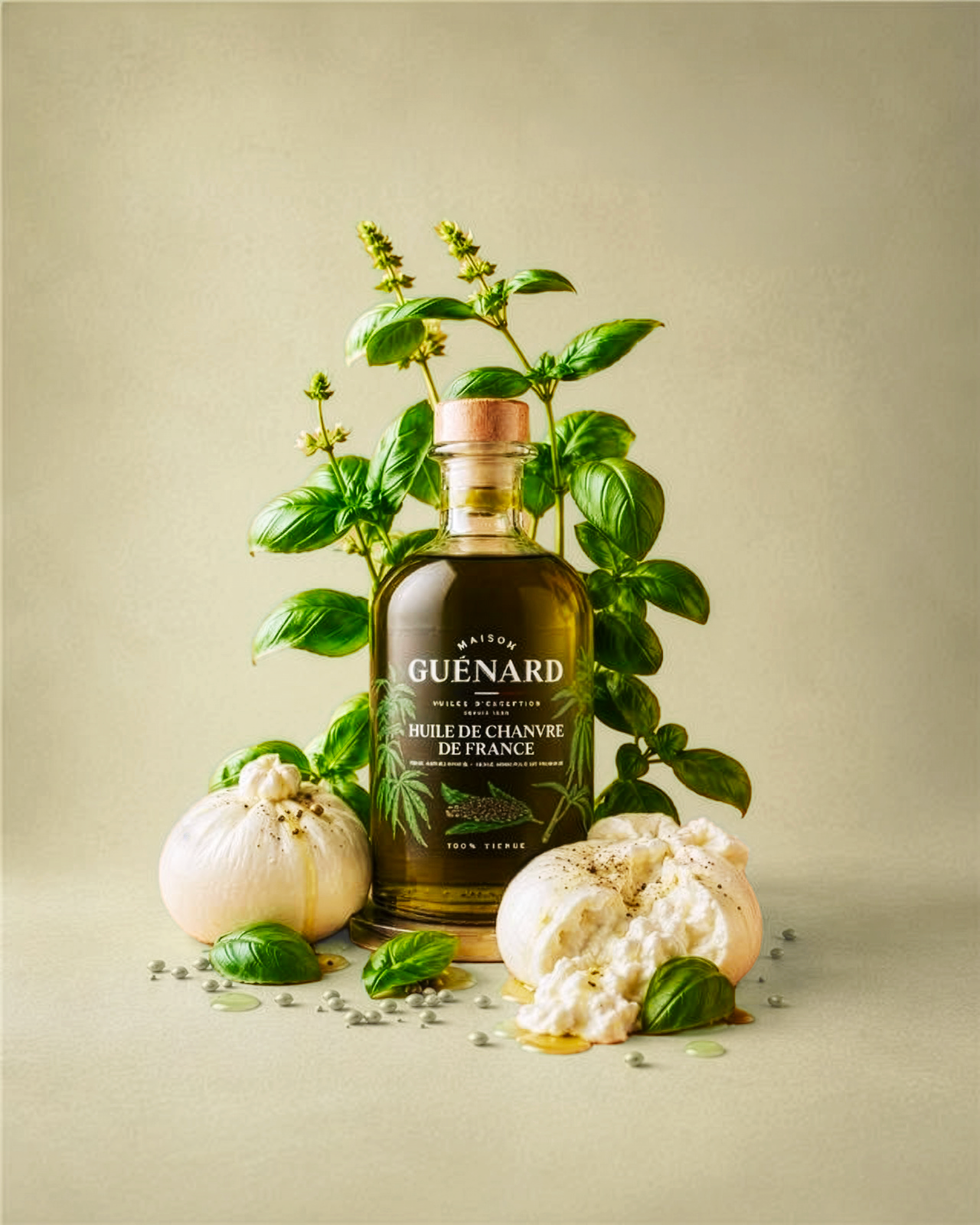
The illustration system was created to celebrate the ingredients at the heart of Maison Guénard. Detailed botanical drawings bring each fruit and plant to life, adding richness, craft and a sense of authenticity to the identity while making every oil instantly distinctive.
The illustrations were co-created with Marianne Ratier, combining her expressive style with Aoka’s art direction to build a visual language rooted in nature, savoir-faire and the Maison’s heritage.

Built to live beyond the launch
More than a set of guidelines, the brandbook gives Maison Guénard a clear and coherent framework for the future. It brings together the identity, packaging principles, typography, colour, illustration and photography into one shared system, helping every new expression of the brand stay consistent while leaving room to evolve.
Designed as a long-term tool, it now supports Guénard in deploying the new identity across products, communication and future brand applications with the same level of care and consistency.