
Moët & Chandon
Natura Nostra Natura Nostra is Moët & Chandon’s biodiversity programme, created to protect the Champagne region and the natural heritage behind its wines. Aoka developed an identity that turns this long-term commitment into a clear and engaging visual language. Rooted in nature yet distinctly connected to the Maison, the system brings together its four pillars: working with nature, protecting the soil, preserving its heritage and acting collectively.
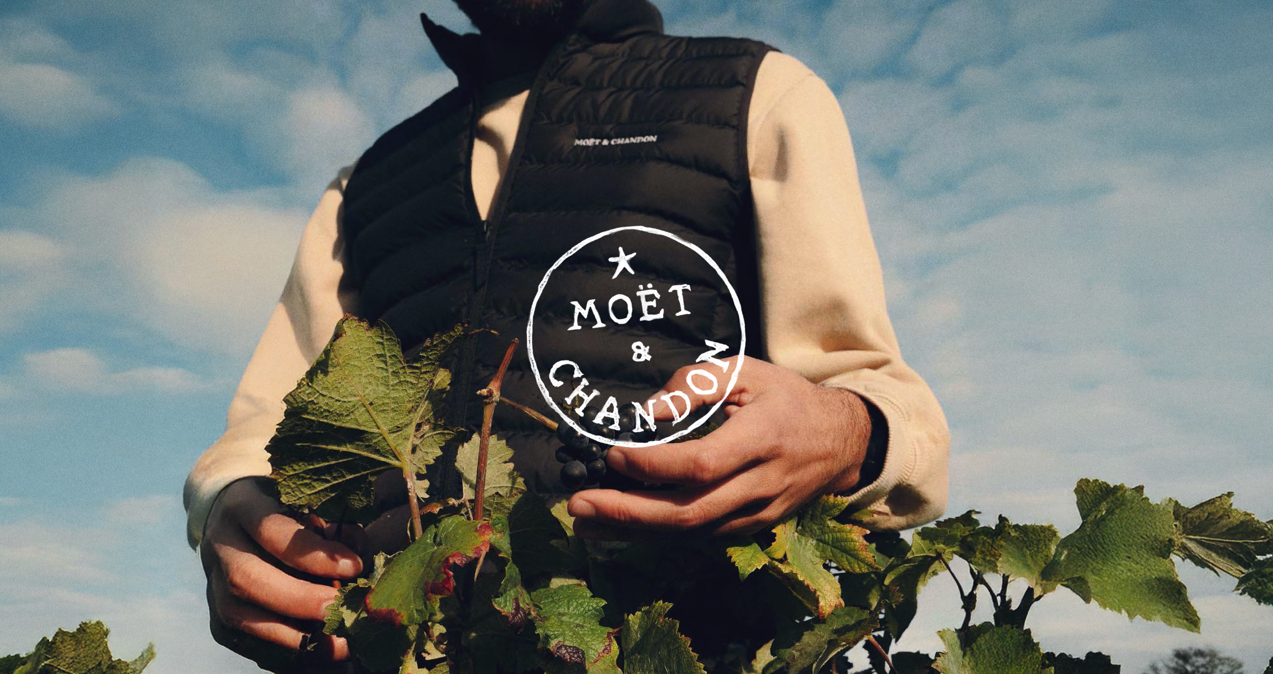
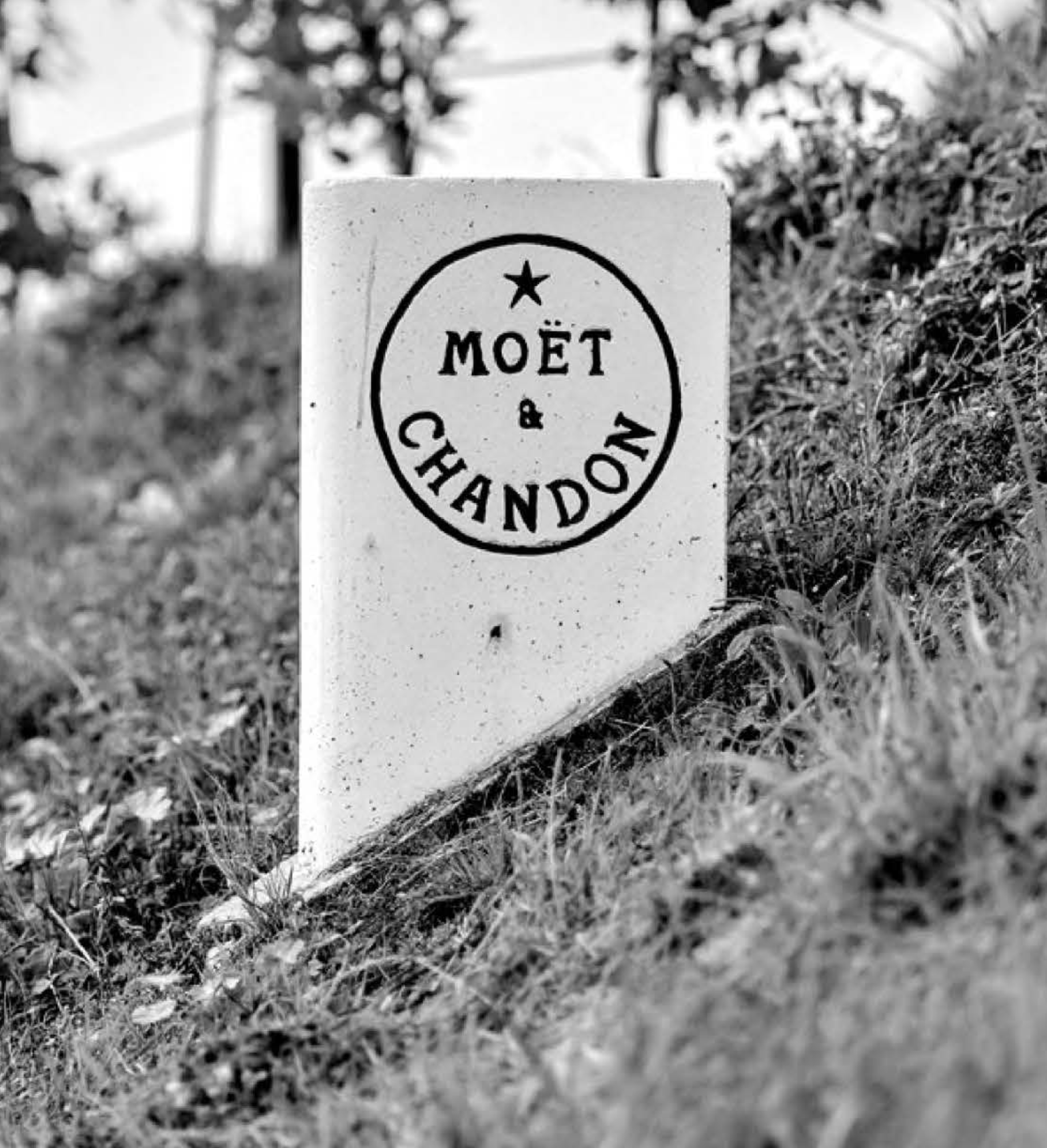
Rooted in Moët’s vineyards
We designed the Natura Nostra logo from the shapes of Moët & Chandon’s vineyard plots, rooting the programme in the land at the heart of the Maison.
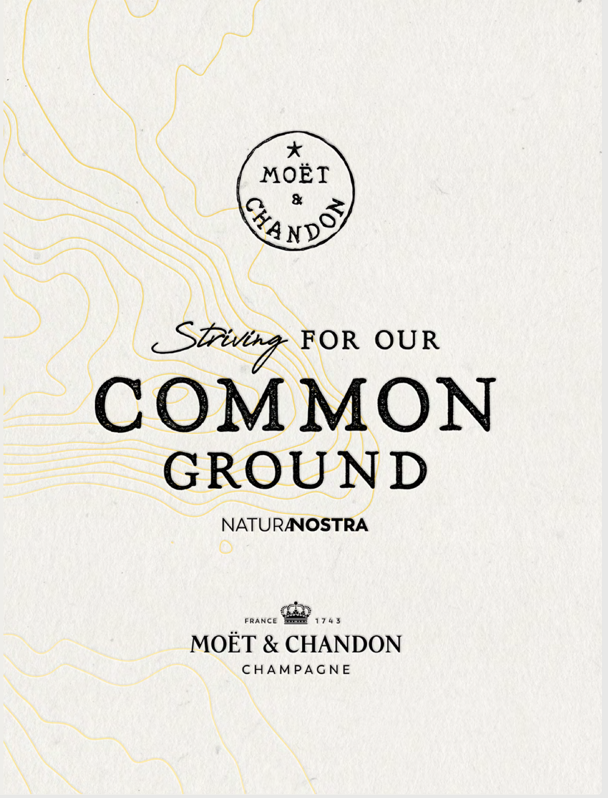
From this mark, we developed a distinctive visual language combining distorted, handcrafted typography with soft, faded natural colours. The result is an organic and raw identity that reflects Natura Nostra’s commitment to nature and biodiversity.
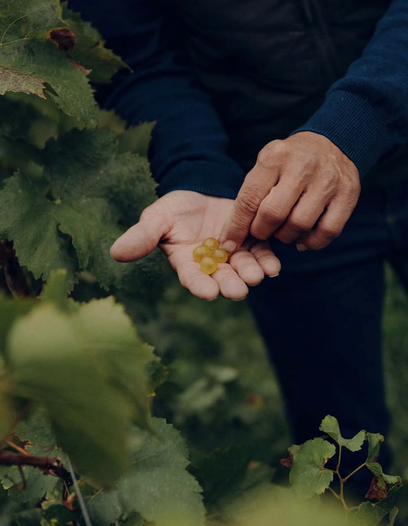
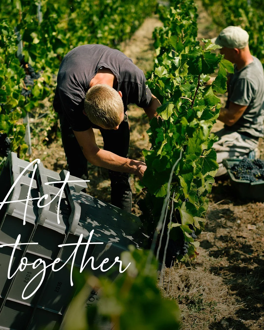
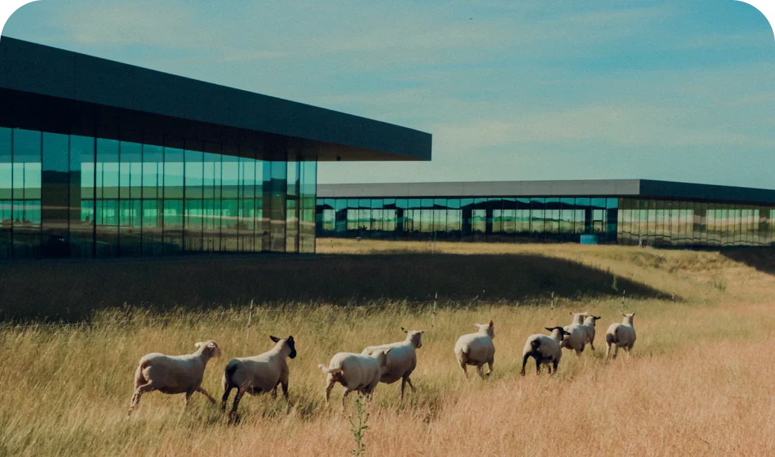
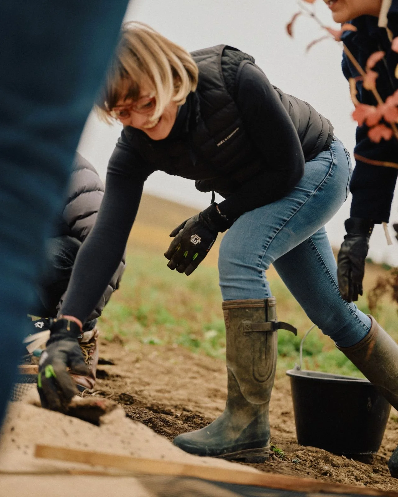
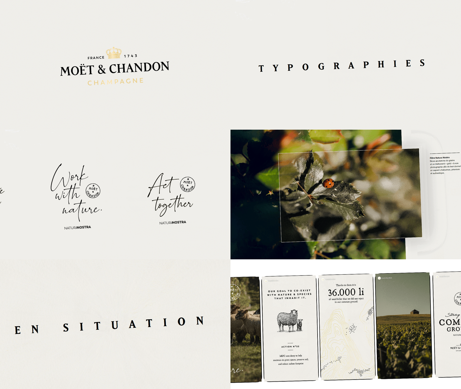
Built to grow over time
We created a simple, functional brand book defining the identity’s core principles and essential visual elements. A clear and flexible foundation designed to ensure consistency across every touchpoint and support Natura Nostra’s development for years to come.